Whether you’re producing brochures, posters, or printed business cards, these elements shape how effective, legible, and impactful your final print will be.
Typography is one of the most powerful design tools in print. The right typeface enhances readability, sets the tone of your message, and strengthens your brand identity.
Key considerations:
Hierarchy matters: Use clear distinctions between headings, subheadings, and body text to guide the reader through your content.
Size consistency: For print, a minimum of 8–10pt is recommended for body text. Anything smaller risks becoming illegible when printed.
Brand alignment: Always stick to your brand’s chosen fonts where possible, consistency builds recognition.
Designing artwork for print isn’t just about having the right file setup. To achieve a polished, professional finish, you also need strong design foundations: typography, layout, and colour workflow. Whether you’re producing brochures, posters, or business cards, these elements shape how effective, legible, and impactful your final print will be.
A strong layout ensures your design is both visually appealing and easy to navigate. Think of it as the roadmap for your audience.
Best practices:
Use grids: A grid system helps create alignment and balance across columns, images, and text.
White space is your friend: Don’t overcrowd your design. White space allows elements to breathe and improves readability.
Focal points: Every page or piece should have a clear visual entry point, this could be a headline, image, or call-to-action.
Consistency across collateral: Keep margins, spacing, and alignment uniform across all marketing materials to reinforce professionalism.
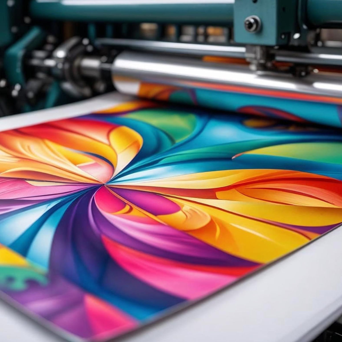
One of the most common issues in print design is colour inconsistency. What looks great on a monitor can appear completely different in print if not managed properly.
Tips for a smooth colour workflow:
Design in CMYK, not RGB: CMYK (Cyan, Magenta, Yellow, Black) is the standard for print. Designing in RGB often results in unexpected colour shifts when files are converted.
Calibrate your monitor: A calibrated screen helps ensure the colours you see on-screen are closer to what will be produced in print.
Use Pantone colours where required: For strict brand guidelines or spot colours, Pantone ensures accuracy and consistency.
Check proof prints: Always request a proof or test print for important projects. It’s the best way to catch any colour issues before full production.
Great print starts with great design. If typography, layout, or colour workflows feel overwhelming, our in-house design team can take care of it for you. We work with businesses of all sizes to create artwork that’s not only visually striking but also fully optimised for print production. From business cards and brochures to large-format graphics, we’ll ensure your designs are both on-brand and press-ready.
Explore our design services to see how we can support your next project.
Phone
0113 203 6030
Email
info@activeprintsolutions.com
Address
Unit A4 Wyther Drive
Wyther Park Ind Est
Leeds
LS5 3AP
Monday to Friday, 9am-5pm
Closed Weekends & Bank Holidays
Subscribe To Our Newsletter


© 2003-2025. Registered in England and Wales No. 04910280.
Recent News – Privacy & Cookie Policy – Sitemap